
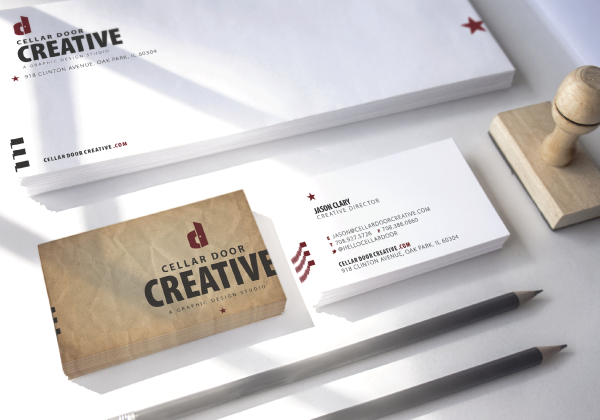
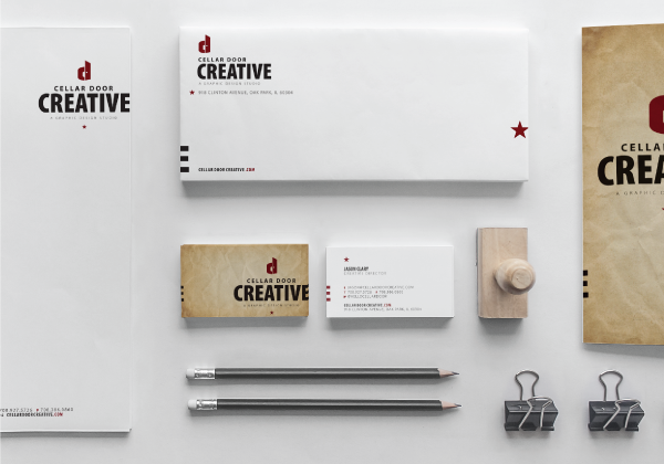
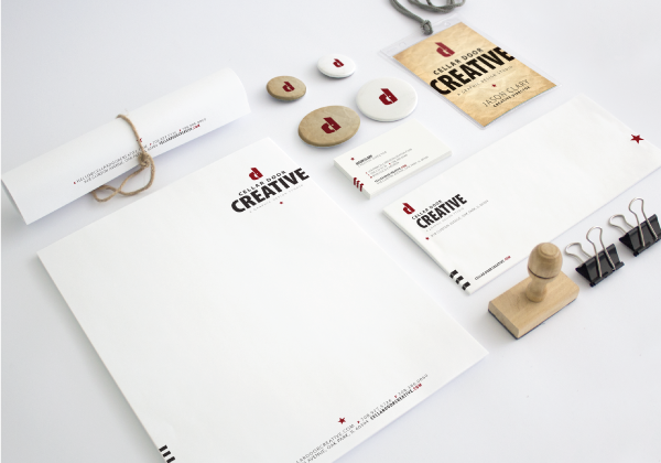
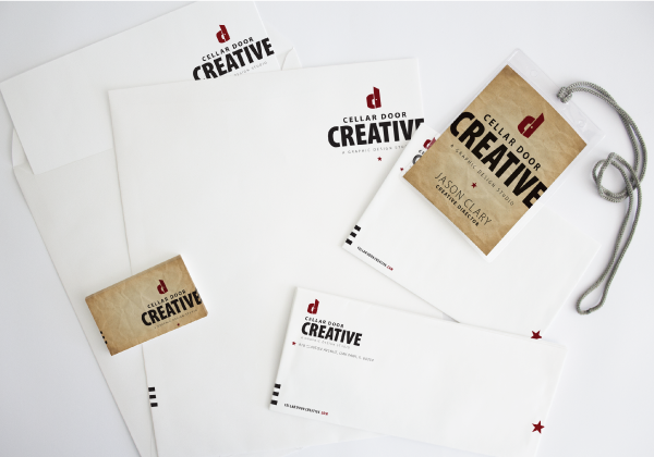
This branding project was a personal one. developing the logo and stationery system for my own design studio, Cellar Door Creative. The goal was to create a mark that was clean, conceptual, and memorable, while nodding subtly to the studio’s name and philosophy. The final logo combines the initials “C” and “D” into a single, monogram-style form, incorporating a simplified doorway at its core. This central "door" not only reinforces the name but also symbolizes access to ideas, collaboration, and creative potential. The supporting stationery system extends the brand with understated typography, intentional use of white space, and a minimal color palette that allows the logo to take center stage. The result is an identity that feels modern, thoughtful, and quietly distinctive—much like the work Cellar Door Creative strives to produce.